
Mastering the Art of Site Structure: Building a Solid Foundation for Online Success
Site Structure: The Backbone of a Successful Website
When it comes to building a successful website, one of the key elements that often gets overlooked is site structure. A well-organized and logical site structure not only enhances user experience but also plays a crucial role in search engine optimization (SEO). In this article, we will explore the importance of site structure and provide tips on how to create an effective one.
What is Site Structure?
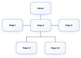
Site structure refers to the way a website’s pages are organized and interconnected. It determines how information is categorized, grouped, and linked within a website. A clear and intuitive site structure makes it easier for users to navigate through the content and find what they are looking for. At the same time, search engines rely on site structure to understand the hierarchy and relevance of web pages.
The Benefits of a Well-Structured Site
User Experience: A well-structured site ensures that users can easily find the information they need. By organizing content into logical categories and providing clear navigation menus, visitors can navigate through your website effortlessly. This improves user satisfaction, reduces bounce rates, and encourages them to spend more time exploring your site.
SEO Friendliness: Search engines like Google use site structure as one of the factors to determine how relevant and valuable your website is. An organized structure helps search engine crawlers understand your content better, leading to improved indexing and higher visibility in search results. Additionally, a well-structured site makes it easier for search engines to identify important pages on your website.
Tips for Creating an Effective Site Structure
Plan Your Hierarchy: Before starting with your website design or development, take some time to plan out the hierarchy of your pages. Determine main categories or sections that will serve as top-level navigation items and then create subcategories under each section if necessary.
Use Clear Navigation Menus: Navigation menus act as roadmaps for users navigating through your website. Ensure that your menus are prominently displayed, easy to understand, and provide clear links to relevant pages. Consider using drop-down menus or breadcrumb navigation for deeper levels of content.
Implement Internal Linking: Internal linking is an effective way to establish connections between related pages on your website. By strategically linking relevant content together, you not only help users discover related information but also assist search engines in understanding the context and importance of different pages.
Optimize URL Structure: A clean and organized URL structure contributes to both user experience and SEO. Use descriptive keywords in your URLs that reflect the content of the page, making it easier for users to understand what they can expect from clicking on the link.
Monitor and Update: Regularly review your site structure and make necessary updates as your website grows or changes over time. Keep an eye on any broken links or outdated pages that may hinder user experience or affect search engine rankings.
In conclusion, a well-structured site is a fundamental component of a successful website. By prioritizing site structure during the development process, you create a user-friendly environment that enhances navigation and improves SEO performance. Remember to plan your hierarchy carefully, optimize navigation menus, implement internal linking strategies, optimize URL structure, and regularly monitor and update your site structure for ongoing success.
So, whether you’re building a new website or looking to improve an existing one, investing time and effort into creating a solid site structure will undoubtedly pay off in terms of user satisfaction, search engine visibility, and overall online success.
8 Essential Tips for Optimizing Your Website’s Structure
- Use clear and descriptive page titles to help users understand what they are looking at.
- Make sure the navigation menu is easy to find and use, with logical groupings of pages and links.
- Keep content short and concise, so it’s easier to scan quickly for the information users need.
- Include search functionality on your site if you have a lot of content or pages, as this will make it easier for users to find what they are looking for quickly.
- Optimise your website for mobile devices by making sure all content displays correctly on small screens too.
- Incorporate breadcrumbs into the structure of your website so that users can easily track where they are in relation to other pages on the site, and navigate back up levels if needed.
- Create an XML sitemap which contains all the URLs of your website and submit it to Google Search Console – this will help Google crawl your site more efficiently when indexing new content or changes you make over time.
- Test out different versions of page layouts using A/B testing in order to determine which version works best for user engagement and conversion rates before making any changes live on the site permanently
Use clear and descriptive page titles to help users understand what they are looking at.
Use Clear and Descriptive Page Titles: Guiding Users to Relevant Content
When it comes to creating a user-friendly website, one simple yet often overlooked aspect is the importance of clear and descriptive page titles. Page titles play a crucial role in helping users understand what they are looking at and navigate through your website effectively. In this article, we will delve into the significance of using clear and descriptive page titles and how they can enhance the user experience.
Why are Clear and Descriptive Page Titles Important?
Page titles act as concise summaries that provide users with an immediate understanding of the content on a particular webpage. They are displayed in search engine results pages (SERPs) and browser tabs, giving users a glimpse into what they can expect when they click on a link. Here’s why clear and descriptive page titles matter:
Improved User Experience: When users are searching for specific information or browsing through multiple tabs, clear and descriptive page titles help them quickly identify relevant content. A well-crafted title provides clarity, sets expectations, and enables users to make informed decisions about which pages to visit.
Enhanced Search Engine Optimization (SEO): Search engines also rely on page titles to determine the relevance of web pages to specific search queries. By using clear and descriptive keywords in your page titles, you increase the chances of your website appearing prominently in search results for relevant queries. This can lead to higher organic traffic and improved visibility for your website.
Tips for Creating Clear and Descriptive Page Titles
To make the most of your page titles, consider implementing these tips:
Be Concise: Keep your page titles concise while still conveying the essence of the content. Aim for around 50-60 characters so that they appear fully in SERPs without being truncated.
Use Relevant Keywords: Incorporate relevant keywords that accurately represent the content on each webpage. This helps both users and search engines understand what the page is about.
Be Specific: Avoid using generic or vague page titles that provide little information. Instead, be specific and highlight the unique aspects of the page’s content.
Reflect the Content: Ensure that your page titles accurately reflect the content on each webpage. Misleading or unrelated titles can lead to user frustration and increased bounce rates.
Maintain Consistency: Establish a consistent format for your page titles across your website, making it easier for users to navigate and understand the structure of your site.
Test and Refine: Regularly review and analyze the performance of your page titles. Use analytics tools to assess user engagement, click-through rates, and search engine rankings. Based on these insights, refine your page titles to optimize their effectiveness.
In conclusion, clear and descriptive page titles are an essential element of an effective site structure. By providing users with a clear understanding of what they can expect from each webpage, you enhance their overall browsing experience. Moreover, incorporating relevant keywords in your titles can contribute to improved search engine visibility and organic traffic.
So, take the time to craft clear and descriptive page titles that accurately represent the content on each webpage of your website. By doing so, you will guide users towards relevant information while also boosting your website’s SEO performance.
Make sure the navigation menu is easy to find and use, with logical groupings of pages and links.
Make Your Navigation Menu User-Friendly: Key to a Well-Structured Website
When it comes to creating a well-structured website, one essential tip that should never be overlooked is ensuring that your navigation menu is easy to find and use. The navigation menu acts as a roadmap for users, guiding them through your website and helping them find the information they need. In this article, we will explore the importance of a user-friendly navigation menu and provide tips on how to create one with logical groupings of pages and links.
The navigation menu serves as the backbone of your website’s structure, allowing users to effortlessly navigate between different sections and pages. Here are some key reasons why having an easy-to-use navigation menu is crucial:
Enhances User Experience: A user-friendly navigation menu ensures that visitors can quickly find what they are looking for on your website. By organizing your pages into logical groupings, you make it easier for users to understand where they need to go to access specific information. This improves their overall experience on your site and encourages them to stay longer.
Improves Accessibility: An intuitive navigation menu is particularly important for users with disabilities or those using assistive technologies. It allows them to navigate through your site more easily, ensuring inclusivity and equal access to all visitors.
Aids Search Engine Optimization (SEO): Search engines consider the structure of your website when determining its relevance and ranking in search results. A well-organized navigation menu helps search engine crawlers understand the hierarchy of your pages and how they are interconnected. This can positively impact your SEO efforts by improving indexing and visibility.
To create a user-friendly navigation menu with logical groupings of pages and links, consider the following tips:
Keep It Simple: Avoid overwhelming visitors with too many options in your navigation menu. Stick to the most important sections or categories that represent the main content areas of your website. This ensures a clean and uncluttered menu that is easy to scan and understand.
Organize with Logic: Group related pages together under relevant categories. Think about how users would naturally expect to find information on your site and structure your menu accordingly. For example, if you have an e-commerce website, you might have separate categories for different product types or brands.
Use Clear Labels: Make sure the labels for each menu item are descriptive and easy to understand. Avoid using jargon or ambiguous terms that may confuse users. Use concise and meaningful labels that accurately represent the content of the linked pages.
Consider Sub-Menus: If you have a large number of pages or subcategories, consider using drop-down menus or sub-menus to create a hierarchy within your navigation menu. This allows users to access deeper levels of content without cluttering the main menu.
By prioritizing a user-friendly navigation menu with logical groupings of pages and links, you enhance the overall structure and usability of your website. Remember to keep it simple, organize with logic, use clear labels, and consider sub-menus when necessary.
A well-designed navigation menu not only improves user experience but also contributes to better SEO performance by helping search engines understand your site’s structure. So, take the time to carefully plan and implement an intuitive navigation system that will guide your visitors seamlessly through your website’s content.
Keep content short and concise, so it’s easier to scan quickly for the information users need.
The Power of Concise Content: Enhancing User Experience in Site Structure
In today’s fast-paced digital world, users crave instant access to information. When it comes to site structure, one effective tip that can greatly enhance user experience is to keep content short and concise. By presenting information in a clear and succinct manner, you make it easier for users to quickly scan and find the information they need. Let’s explore why this tip is crucial and how it can benefit your website.
Improved Readability and Scannability
Long paragraphs filled with excessive text can be overwhelming for users. By keeping content short and concise, you create a more readable format that allows visitors to scan through the text effortlessly. Utilize subheadings, bullet points, and numbered lists to break down information into easily digestible chunks. This approach not only enhances readability but also improves scannability, enabling users to quickly identify key points or specific details they are looking for.
Enhanced User Engagement
When users land on a webpage, they typically have a specific goal in mind or are seeking answers to their questions. By presenting content in a concise manner, you help them find the desired information more efficiently. This leads to increased user engagement as visitors are more likely to stay on your site longer, explore other pages, or even convert into customers if they find what they need without any hassle.
Mobile-Friendly Experience
With the rise of mobile usage, it’s essential to optimize your site structure for smaller screens. Shorter and more concise content translates well across different devices and screen sizes. It ensures that users accessing your website from smartphones or tablets can easily navigate through the information without having to scroll excessively or strain their eyes reading lengthy paragraphs.
Improved SEO Performance
Search engines value user-friendly websites that provide relevant and valuable content. Concise content not only improves user experience but also contributes positively to your search engine optimization efforts. Search engine algorithms prioritize websites that offer clear and concise information, as it aligns with the user’s intent and provides a better overall experience. By optimizing your content for readability and scannability, you increase the likelihood of higher search engine rankings and visibility.
In conclusion, keeping content short and concise is a powerful tip that greatly enhances user experience within site structure. By presenting information in a digestible format, you improve readability, engage users more effectively, provide a mobile-friendly experience, and boost your SEO performance. Remember to prioritize clarity and simplicity when crafting your content, ensuring that users can quickly scan through and find the information they need. By implementing this tip, you create a user-centric website that delivers value efficiently.
Include search functionality on your site if you have a lot of content or pages, as this will make it easier for users to find what they are looking for quickly.
Enhance User Experience with Search Functionality on Your Website
In today’s digital age, websites often contain a vast amount of content and numerous pages. Navigating through such extensive content can be overwhelming for users, leading to frustration and potentially causing them to leave your site. To alleviate this issue and provide a seamless user experience, incorporating search functionality on your website is crucial.
Why Include Search Functionality?
By including a search bar or search functionality on your website, you empower users to quickly find the specific information they are looking for. Here are some key benefits of integrating search functionality into your site structure:
Efficient Navigation: With a large amount of content or numerous pages, users may struggle to locate the exact information they need by manually browsing through menus and categories. A search function eliminates this hassle by allowing users to directly enter relevant keywords or phrases, instantly retrieving the most relevant results.
Time-Saving: Time is precious, and users appreciate websites that respect their time. By providing a search feature, you enable visitors to find what they need swiftly without having to spend unnecessary time browsing through multiple pages. This enhances user satisfaction and increases the likelihood of them staying on your site longer.
Improved User Satisfaction: When users can easily find what they are looking for, it creates a positive impression of your website. By offering an efficient search function, you demonstrate that you value their needs and strive to provide them with a seamless experience. Satisfied users are more likely to return to your site in the future.
Enhanced Engagement: The ability for users to quickly locate desired information encourages them to engage more deeply with your website. Whether it’s reading articles, exploring products or services, or accessing specific resources, an effective search function ensures that visitors can effortlessly access the content that interests them most.
Implementing Search Functionality
To implement search functionality effectively, consider the following tips:
Visible Placement: Place the search bar in a prominent location on your website, such as the header or sidebar. This ensures that users can easily locate it without having to search for the search feature itself.
Auto-Suggestions: Incorporate auto-suggestions or predictive text in your search bar to assist users in refining their queries. This feature can help users find relevant content even if they are unsure of the exact keywords to use.
Responsive Design: Ensure that your search functionality is responsive and compatible with various devices and screen sizes. Users should be able to access and use the search feature seamlessly, regardless of whether they are on a desktop computer, tablet, or mobile device.
Including a search function on your website is an effective strategy for improving user experience and streamlining navigation, particularly when dealing with extensive content or numerous pages. By making it easier for users to find what they are looking for quickly, you enhance engagement, satisfaction, and overall success of your website. So why not integrate this valuable tool into your site structure today?
Optimise your website for mobile devices by making sure all content displays correctly on small screens too.
Optimize Your Website for Mobile Devices: Ensuring Seamless Content Display on Small Screens
In today’s digital era, mobile devices have become an integral part of our lives. With the majority of internet users accessing websites through their smartphones and tablets, it is crucial to optimize your website for mobile devices. One important aspect of this optimization is ensuring that all content displays correctly on small screens.
A responsive design is key to achieving a seamless user experience across different devices. It allows your website to adapt and adjust its layout automatically based on the screen size of the device being used. By implementing responsive design principles, you can ensure that your website looks and functions optimally on both desktop and mobile screens.
When it comes to optimizing content for mobile devices, there are a few key considerations:
- Simplify Your Design: On smaller screens, space is limited, so it’s important to simplify your design elements. Avoid cluttered layouts and excessive text. Focus on presenting concise and visually appealing content that captures users’ attention without overwhelming them.
- Use Responsive Images: Images play a significant role in engaging users and conveying information. However, large images can slow down page loading times on mobile devices. Optimize your images by compressing them without compromising quality. Additionally, use CSS media queries to ensure that images resize proportionally based on screen size.
- Ensure Readability: Text content should be legible on small screens without requiring users to zoom in excessively. Use a legible font size and consider using larger headings or subheadings to break up text blocks. Pay attention to line spacing and ensure adequate contrast between text color and background for easy reading.
- Test Across Multiple Devices: It’s essential to test your website across various mobile devices with different screen sizes and resolutions. This process helps identify any display issues or inconsistencies that may arise due to variations in device capabilities or browser compatibility.
By optimizing your website for mobile devices, you enhance the user experience and cater to the growing number of mobile users. This, in turn, can lead to increased engagement, longer site visits, and improved conversion rates.
Remember, in today’s fast-paced world, users expect websites to be easily accessible and visually appealing on any device. By ensuring that all content displays correctly on small screens through responsive design techniques, you provide a seamless browsing experience that keeps visitors coming back for more.
So, take the time to optimize your website for mobile devices. Your efforts will not only benefit your users but also contribute to better search engine rankings and overall online success.
Incorporate breadcrumbs into the structure of your website so that users can easily track where they are in relation to other pages on the site, and navigate back up levels if needed.
Enhance User Navigation with Breadcrumbs: A Pathway to Easy Exploration
When it comes to improving user experience and navigation on your website, breadcrumbs are an invaluable tool. Incorporating breadcrumbs into the structure of your website allows users to easily track their location within the site’s hierarchy and navigate back up levels if needed. In this article, we will explore the benefits of using breadcrumbs and how they can enhance user satisfaction.
What are Breadcrumbs?
Breadcrumbs are a navigational aid that displays a hierarchical trail of links, typically located at the top or bottom of a webpage. They provide users with a visual representation of their current location within the site’s structure. The term “breadcrumbs” is derived from the fairy tale Hansel and Gretel, where they left a trail of breadcrumbs to find their way back home.
The Benefits of Breadcrumbs
Improved User Navigation: Breadcrumbs act as signposts, helping users understand where they are within your website’s structure. This can be particularly useful for larger websites with multiple levels of content. Users can easily track their path and navigate back up levels if they need to explore other sections or categories.
Enhanced User Experience: By providing clear navigation aids, such as breadcrumbs, you enhance the overall user experience on your website. Users feel more confident and in control as they can quickly understand how different pages relate to each other.
Reduced Bounce Rates: Breadcrumbs help reduce bounce rates by encouraging users to explore more pages on your website. When visitors can easily see related content and navigate between different sections, they are more likely to stay longer and engage with your site.
Implementing Breadcrumbs
Choose an Appropriate Style: There are different types of breadcrumb styles you can choose from, such as hierarchical (Home > Category > Subcategory > Page) or attribute-based (Home > Page [Tag]). Consider your website’s structure and choose a style that best suits your needs.
Place Breadcrumbs Strategically: Breadcrumbs are typically placed at the top or bottom of a webpage, either horizontally or vertically. Ensure they are clearly visible and easily distinguishable from the rest of the content.
Use Schema Markup: Adding schema markup to your breadcrumbs can provide additional benefits. It helps search engines understand the structure of your site and may enhance the appearance of your breadcrumbs in search engine results, attracting more clicks.
Ensure Consistency: Keep your breadcrumb navigation consistent across all pages on your website. This helps users familiarize themselves with the navigation pattern and makes it easier for them to navigate around different sections.
Incorporating breadcrumbs into your website’s structure is a simple yet effective way to improve user navigation and overall user experience. By providing users with a clear pathway and easy access to different levels of content, you create a more intuitive browsing experience that encourages exploration.
So, whether you have a small business website or an extensive e-commerce platform, consider implementing breadcrumbs to guide users through your site’s hierarchy. With breadcrumbs as their virtual trail of navigation, users will feel empowered to explore more and engage further with your valuable content.
Create an XML sitemap which contains all the URLs of your website and submit it to Google Search Console – this will help Google crawl your site more efficiently when indexing new content or changes you make over time.
Enhance Google’s Understanding of Your Website with an XML Sitemap
When it comes to optimizing your website’s site structure, one crucial tip is to create and submit an XML sitemap to Google Search Console. An XML sitemap is a file that contains all the URLs of your website, providing a roadmap for search engine crawlers to navigate and index your content more efficiently.
Why is an XML Sitemap Important?
By submitting an XML sitemap to Google, you ensure that the search engine can easily discover and understand the structure of your website. This helps Google crawl and index your web pages more effectively, especially when you make changes or add new content over time. Without a sitemap, there’s a chance that some of your web pages may go unnoticed or take longer to be indexed.
How Does it Benefit Your Website?
Improved Indexing: By providing Google with a comprehensive list of URLs through an XML sitemap, you increase the chances of all your web pages being indexed. This is particularly beneficial if you have a large website with numerous pages or if some pages are not easily accessible through internal links.
Efficient Crawling: When search engine crawlers encounter an XML sitemap, they can quickly determine the most important and recently updated pages on your website. This enables them to prioritize crawling those pages and ensures that any changes or new content are discovered promptly.
Enhanced Visibility: Submitting an XML sitemap helps Google better understand the structure and relevance of your website’s content. This can lead to improved visibility in search results as it enables the search engine to present more accurate information about your web pages.
How to Create and Submit an XML Sitemap
Creating an XML sitemap is relatively straightforward. There are various online tools and plugins available that can generate one for you automatically based on your website’s structure. Once created, follow these steps to submit it to Google Search Console:
- Sign in to your Google Search Console account.
- Select your website property.
- Navigate to the “Sitemaps” section within the “Index” menu.
- Add the URL of your XML sitemap and click “Submit.”
It’s important to note that after submitting your XML sitemap, Google will periodically crawl and update the indexed pages based on the information provided in the sitemap.
In conclusion, creating an XML sitemap and submitting it to Google Search Console is a valuable practice for optimizing your website’s site structure. By doing so, you improve Google’s understanding of your website, enhance indexing efficiency, and increase the visibility of your web pages in search results. So, take advantage of this tip and ensure that your website is being effectively crawled and indexed by one of the most popular search engines on the web.
Test out different versions of page layouts using A/B testing in order to determine which version works best for user engagement and conversion rates before making any changes live on the site permanently
Boosting User Engagement and Conversion Rates: The Power of A/B Testing in Site Structure
When it comes to optimizing your website’s performance, making informed decisions is key. One effective method to determine the most engaging and conversion-friendly page layout is through A/B testing. By testing different versions of your site’s layout, you can gather valuable insights that will help you make data-driven decisions before implementing any permanent changes.
A/B testing involves creating two or more versions of a webpage with slight variations in design, layout, or content. These versions are then presented randomly to different users, allowing you to compare their performance based on specific metrics such as user engagement and conversion rates.
Why is A/B Testing Important for Site Structure?
A well-structured site plays a vital role in capturing users’ attention and guiding them towards desired actions. However, determining the most effective layout can be subjective. What may seem intuitive to you might not resonate with your target audience. This is where A/B testing becomes invaluable.
By conducting A/B tests on your site’s page layouts, you can gain insights into how users interact with different versions. You can measure metrics such as time spent on page, click-through rates, bounce rates, or even completed conversions. This data provides a clear understanding of which version performs better in terms of user engagement and conversion rates.
How to Conduct A/B Testing for Site Structure?
Identify Key Elements: Start by identifying the specific elements of your page layout that you want to test. It could be the placement of call-to-action buttons, navigation menus, content organization, or even visual design elements.
Create Variations: Develop multiple versions of your webpage with variations in the identified elements while keeping other aspects consistent across all versions.
Split Traffic: Use an A/B testing tool or platform to randomly split incoming traffic between the different versions of your webpage.
Gather Data: Monitor and collect data on user behavior, engagement, and conversion rates for each version of the page. This data will provide insights into which layout is performing better.
Analyze Results: Analyze the collected data to identify patterns and determine which version of the page is generating higher user engagement and conversion rates.
Implement Changes: Once you have determined the winning version based on the test results, implement those changes permanently on your site.
Benefits of A/B Testing in Site Structure
A/B testing offers several benefits when it comes to optimizing your site structure:
Data-Driven Decision Making: A/B testing provides concrete data that helps you make informed decisions based on user behavior rather than relying on assumptions or personal preferences.
Improved User Experience: By identifying the most engaging layout through A/B testing, you can enhance the overall user experience, leading to increased satisfaction and longer visits.
Higher Conversion Rates: Testing different versions allows you to identify layouts that encourage users to take desired actions, resulting in improved conversion rates and achieving your website’s goals.
In conclusion, A/B testing is a powerful tool when it comes to optimizing your site structure for better user engagement and conversion rates. By testing different versions before implementing permanent changes, you can ensure that your website’s layout is tailored to meet your users’ needs effectively. Embrace A/B testing as a valuable strategy in your optimization efforts and unlock the potential for enhanced performance and success.